Creativity vs Communism: The Polish School of Propaganda, CYRK and Art Posters

The Polish School of Posters was probably the most famous artistic collective operating under Soviet rule. They were prolific then, and they’re still popular today. The posters they produced were unlike anything seen before, and influenced most of what came after – but thanks to the isolationism of the USSR, their legacy is little known.
What was the Polish School of Posters?
The Polish School of Posters was a loose collective of artists that rose to prominence under the USSR. Formed in the aftermath of World War II, their ‘golden age’ came in the 1950s and 60s, when they were commissioned by the government to create propaganda posters. Given a broadly ‘anti-western’ brief but left otherwise to their own devices, the resulting artworks were intensely aesthetic and surprisingly subversive.
Posters from the Polish School uniquely capture the Soviet zeitgeist. A direct product of their geopolitical context, they offer rare insight into the tension between political expression and artistic freedom.
Why did the USSR Produce Propaganda Posters?
The USSR produced propaganda posters because “the gallery of the poster is the street”. So said Henryk Tomaszewski, one of the masters of the Polish School of Posters. Posters were Communist: cheap and easy to produce, they could be displayed anywhere and understood by anyone. They were the antithesis of elite ‘high art’, only for the enjoyment of the educated upper classes.
That made posters the perfect vehicle for conveying propagandist messages. They became the State’s favoured art form and were heavily invested in by Poland’s Ministry of Art & Culture.
Why was Poland Such an Important Part of the Soviet Propaganda Machine?
The Polish People’s Republic, as it was at the time, was one of the biggest (and therefore most important) Soviet satellite states. From WWII onwards it was a particular focus for propaganda as the USSR attempted to assert itself across a widely dispersed population. There was a material need for not just propaganda broadly, but posters specifically. Poland had been among the worst-hit in WWII and its cities were visibly war-torn. Posters physically papered over the cracks and helped manipulate public perception of the political regime that put them there.
But Poland also had a rich artistic tradition. Warsaw had become something of a creative hub in the 1930s; thanks to its geographical position, the city was a site of confluence for various multicultural influences. Modernism had taken a particularly strong hold and the Polish Poster School was formed on the tailwind of the French poster scene, famed for artists like Toulouse-Lautrec.
How did the Polish School of Posters Begin?
The Polish School of Posters was born out of this unique combination of political imperative and artistic talent. Initially established in Lublin at the close of WWII, it was run by Wlodzimerz Zakrzewski. He had studied in Moscow and was trained in the Soviet Realist style popularised until Stalin’s death in 1953.
It was at this point that the Polish School of Posters proper emerged. As artist Andrzej Klimowski explains, Soviet Realism was replaced by free expression. “There was no market economy, so there was no need to promote products to consume — but rather to educate and enlighten”. Direction from the State was surprisingly loose. Propaganda posters should reject Western ideas, but from there, artists were more or less free to do what they wanted.
What’s Different about the Polish School of Posters?
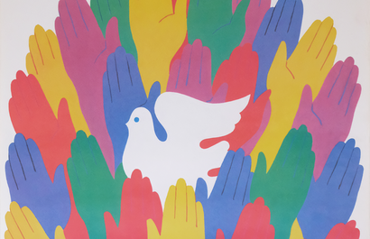
The artworks produced by the Polish School of Posters look very different to what most people expect when they think of the Soviet Union. They’re at a far remove from the simple hammer, sickle and bold red background seen in the first half of the century. They’re also very different from anything that was being produced in the West. Most notable is their use of vibrant colour – surprising in comparison to grey and grim photos of life behind the iron curtain at the time. But there’s no single ‘style’ that unifies the Polish School of Posters. They’re often a mix of graphic and painterly influences, bold typography and illustration.
This new visual language was created because the artists of the Polish School of Posters had such diverse backgrounds. Thanks to State endorsement, posters were the most lucrative (and in fact, one of the only permitted) art forms. It meant that essentially, all artists became poster artists. There was no distinction between graphic artists, illustrators, sculptors, typographers, and fine artists, and posters therefore tend to mix and match between disciplines. Top-tier artists from across the spectrum were creating posters, so they’re not only high-quality, but incredibly original and experimental.
Why was the Polish School of Posters so Subversive?
The Polish School of Posters is as famous for its striking visual style as its scathing politics. Despite their propagandist intent, posters of the Polish School rely heavily on visual metaphors which often reveal a much more subversive message. Perhaps the most famous of these is the CYRK posters, many of which contain coded images criticising the Soviet regime. Posters became a conduit for small moments of resistance, and an opportunity for Poland to quietly express its autonomy and identity.
What is the Legacy of the Polish School of Posters?
The Polish School of Posters’ rejection of strict rules of composition meant it was incredibly influential in the later development of graphic design. Unfortunately, the posters were printed in strict runs and never designed to be kept, so only a small number survive. They’re highly sought-after thanks to their cultural heritage and visual appeal, and because of their unique expression of individual creativity under Communism. Shop our Polish Poster School posters below or explore the collection here.


